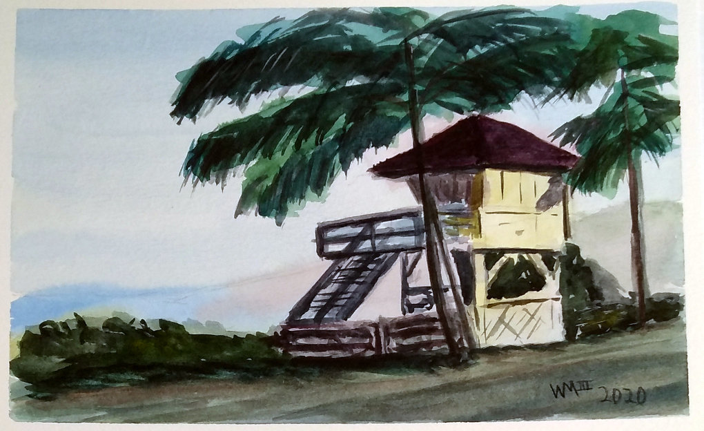
Connecting Shapes in Watercolor - Maui Lifeguard Station
I have been trying to get more of a “loose” feel with my watercolor paintings. I think the technique of connecting large shapes based on a value study is finally clicking with me.
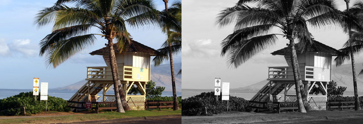
Here is my first attempt using a photo I took of a lifeguard station on a trip to Maui, HI.
I have watched and listened to Liron Yankonsky for a while, and really like his style. He has always talked about connecting as many large/abstract shapes together as part of getting a more unified painting. I could never really figure out how to apply that advice to photo references I chose myself.
Another talented artist I follow is Eric Yi Lin. One of his YouTube videos described and demonstrated the techniques he learned during a watercolor workshop with Andy Evansen. It was after watching this example that it started to make sense.
So I decided to try it out using a photo I took of a lifeguard station in Maui a few years ago. As part of the advice, I zoomed and cropped the image to get it to a point where I would not have dozens of details to make the study too busy-looking. I then created a grayscale version of the image so I could more easily see three levels of values: Light, Mid, and Dark.
I decided to try this out on some of the Canson XL watercolor paper I have. It is not the best paper, but works okay for practicing if you are not doing any heavy wet-in-wet work. It also tends to lift color too easily with subsequent washes. So while it worked well enough for the value study, I would not use it for the color study in the future.
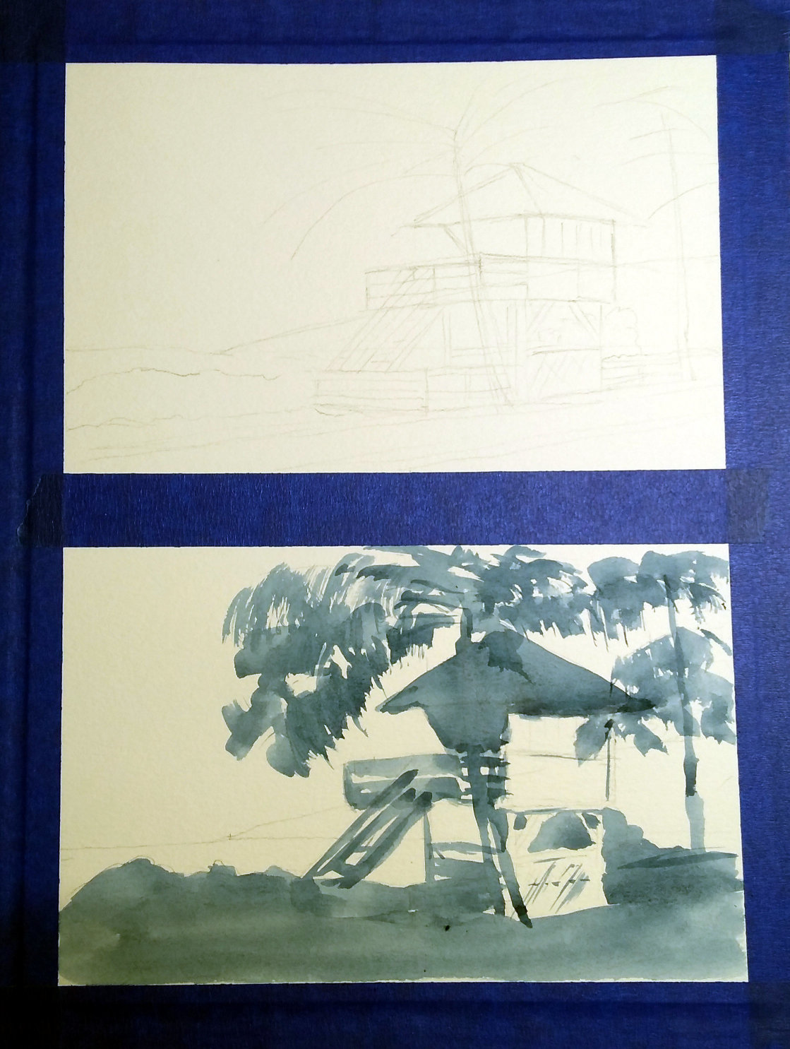
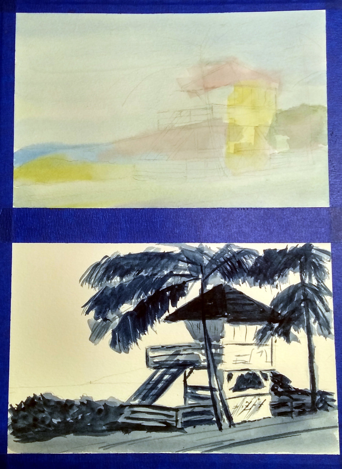
I divided up a 12x9 inch page with tape and created my drawings for the value study and the color study. The value study uses the white of the paper for the light values, a single wash for the mid values, and a darker second wash for the dark values.
Here is what the first wash of the value study (the mid values) looked like. I considered the sky, water, and island mass in the background to be light values, and left them out of this wash.
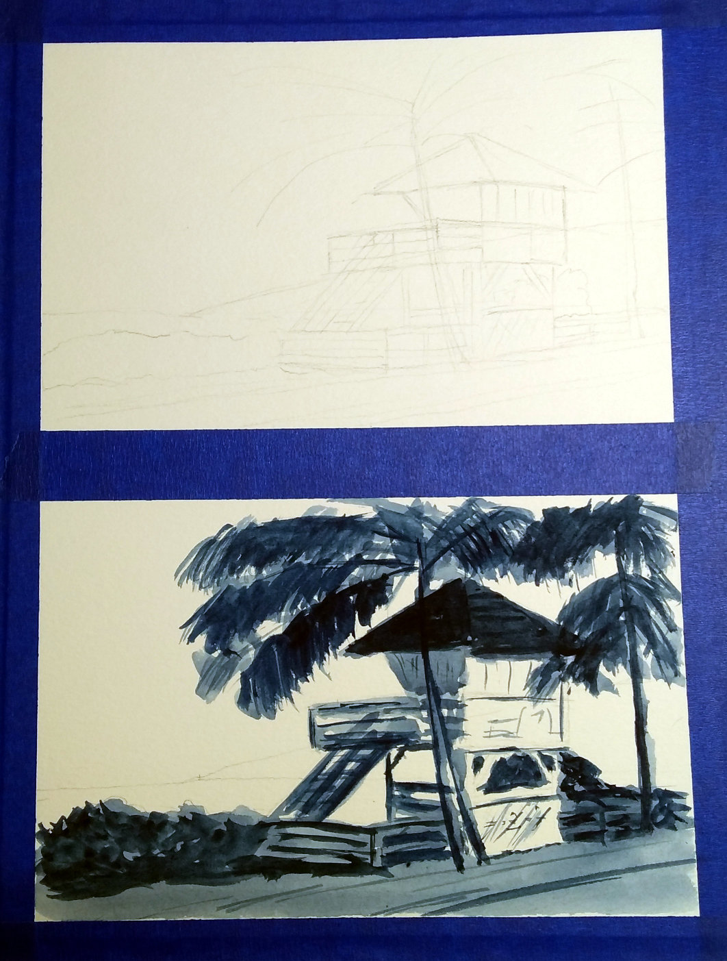
As is common with all watercolor processes (at least for me), the wash is not much to look at at this stage. It is when you add the dark values that things really take shape (literally, in most cases).
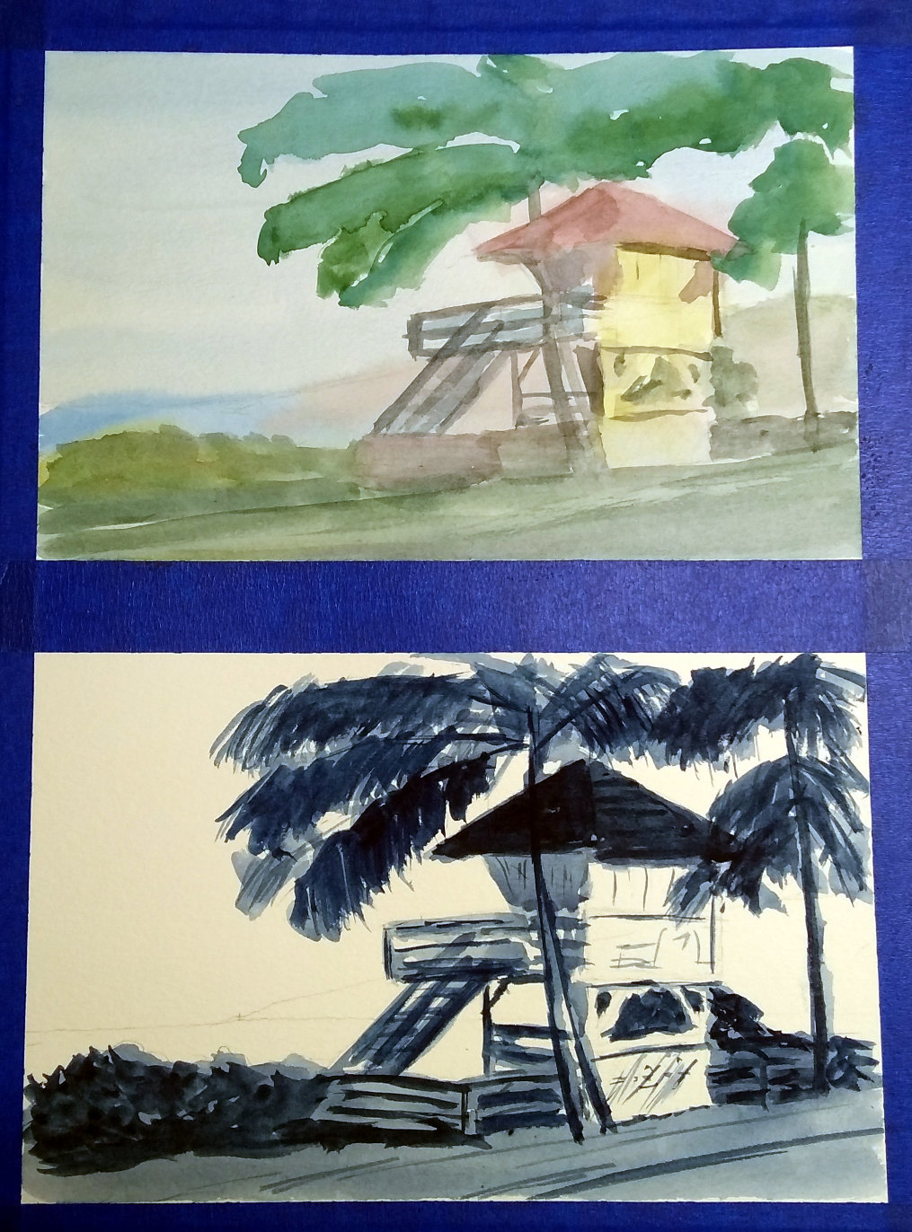
With the value study complete, It was time to put in the wash for light values of the color study. I spend most of my time fighting the Canson XL paper to get a wash going. I would expect to have better luck with some of my cotton paper where I could properly pre-wet the page. I was hoping to add some green for the palm trees during this stage, but it just did not work out.
With the light values down, it was time to move to the mid values. I pre-mixed my colors so I would be able to keep color changes through my connected shapes moving before things dried. The Canson paper refused to cooperate. The wash was not as connected as I was hoping, but I pushed forward.
Finally, it was time to work on the dark values and details. I ran into problems with the paper wanting to release previous layers, causing some areas to be over-worked. However, the values did match up pretty well with the value study.
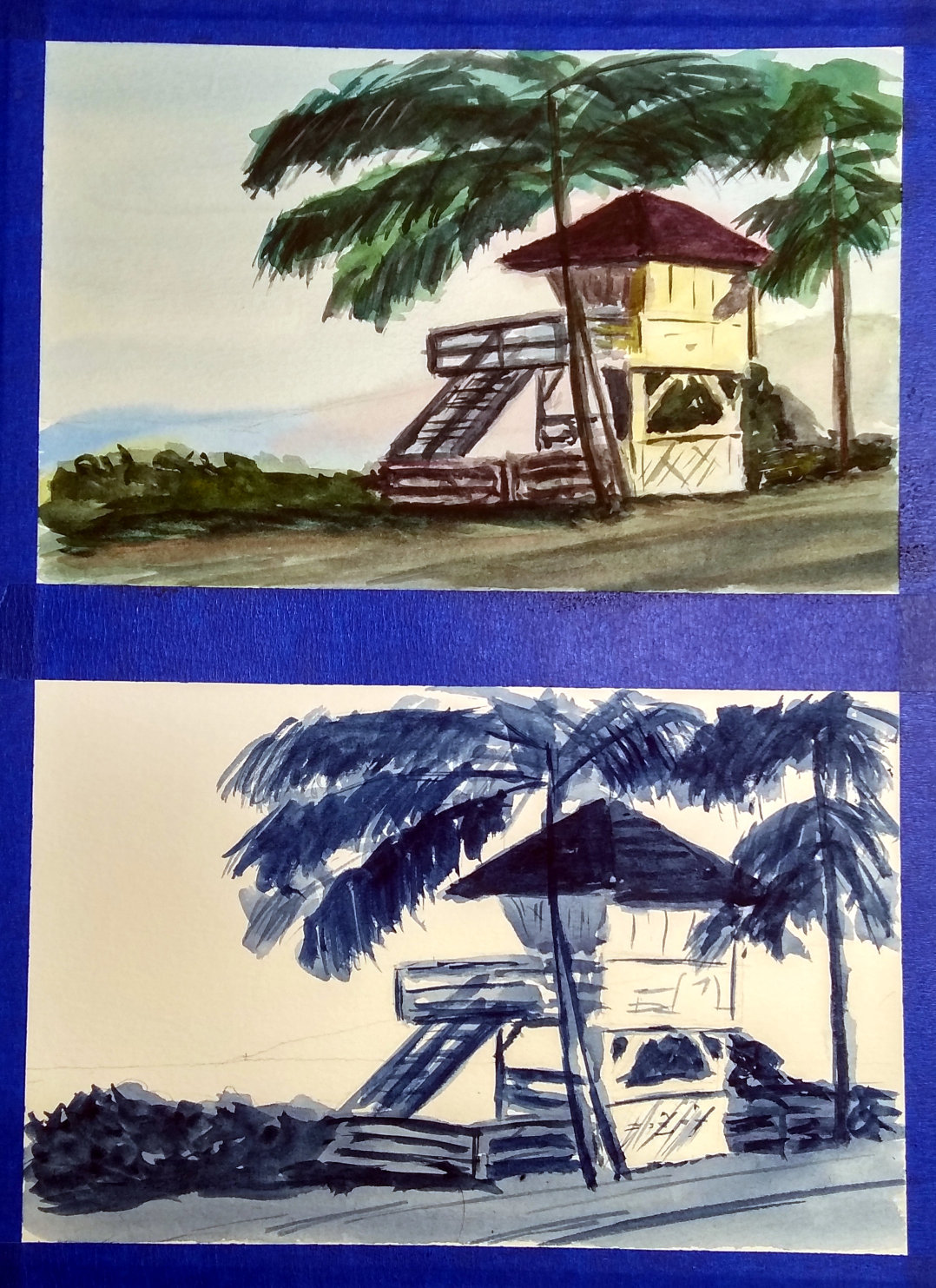
Here are the studies with the tape removed.
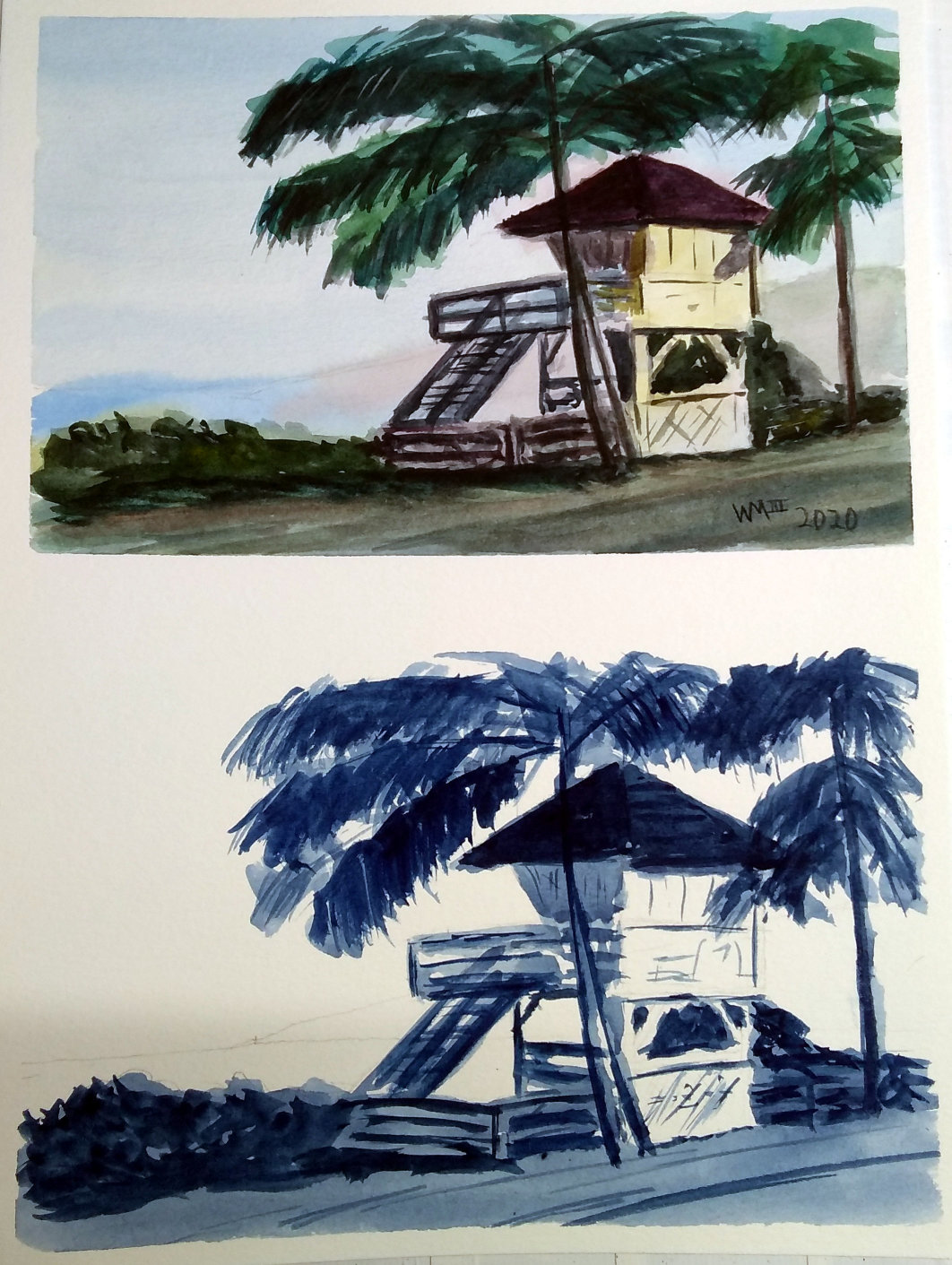
And here is the final color study alone. While I like the way it turned out, the monochromatic value studies can be so nice all on their own.

I appreciate all that I have learned from the dozens (literally) of watercolor artists I follow on YouTube. In particular, Liron and Eric have been really helpful in finding approaches that work well for what I want to accomplish.
Happy painting!